Example 3: Population by sex and age
In this example we will try to answer the following questions:
children of which gender are born more frequently?
does this gender ratio change with age?
To answer these questions we will make the following changes to the grid:
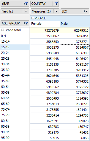
drag the "Age_group" field from the Field list into the row region
drag the "Year" and "Country" fields into the filters region
drag the "Sex" field from the Field list and the measures field to the measure fields region
exclude the values of '100+' and '5-9' from the values of the "Age_group" dimension
leave only 2006 in the "Year" dimension
leave only Russia in the "Country" dimension
These steps produce the following grid:
Just as previously, the raw data is less informative than a chart (though the figures may be important for printed reports), so let's switch to the chart page:
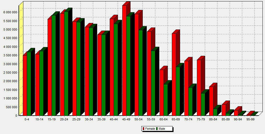
A chart makes it easy to answer our initial questions:
more boys are born than girls
however, from the age group 40-44 more women survive than men